


During my Summer 2025 Graphic Design Internship at RedTag Digital, a Louisville-based advertising agency, I developed the design and visual identity for their new portfolio review event, the Brewtal Review—a vibrant, inclusive space built to connect the next wave of creatives.


In a competitive and uncertain job market, many emerging creatives struggle to showcase their potential or gain meaningful industry access.
RedTag Digital created Brewtal Review to bridge that gap—offering honest, professional feedback and real connection opportunities, all in a supportive, laid-back environment.

Table of contents

Logo System
The Process
Final Deliverables
LOGOMARK
LOGOTYPE
STACKED LOGOTYPE
SPACING
CO-BRANDING
INITIAL IDEAS
BREWTAL WITHIN REDTAG
BREWTAL REDO
FINAL LOGO DEVELOPMENT
ONE-SHEETER
INSTAGRAM CAROUSEL POSTS
WEBSITE WIREFRAME
RACK CARDS
STICKERS
MISC. ASSETS
PATTERNS
EVENT PHOTOS

Logo System
Logo System

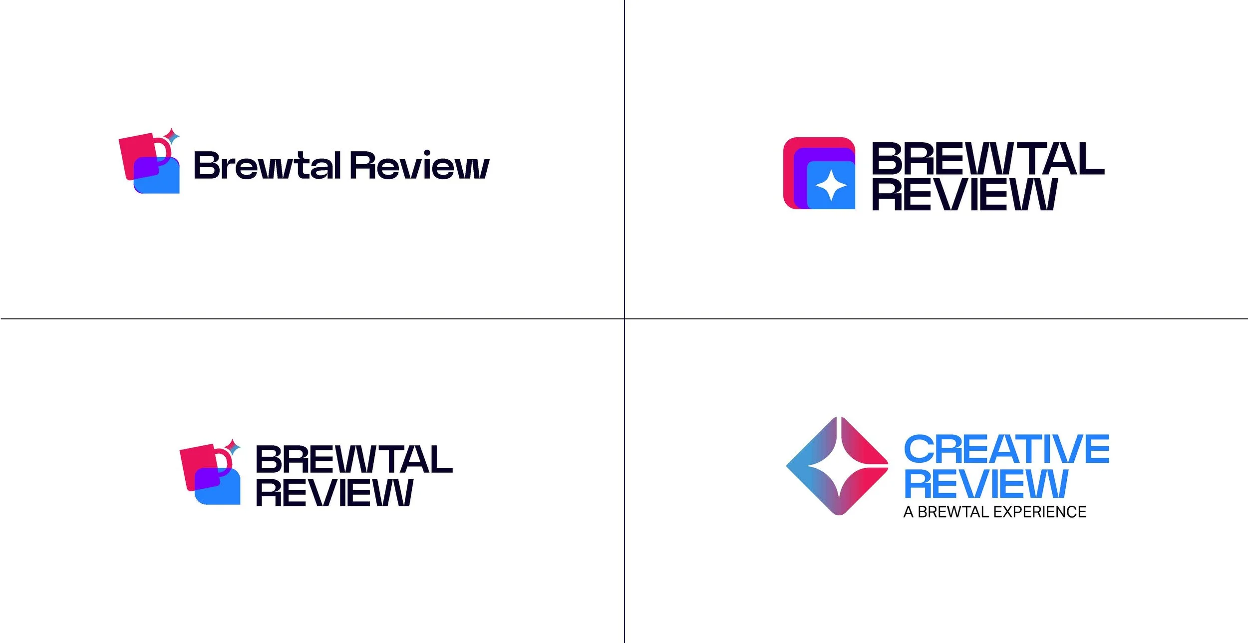
Logomark
The logomark is a stacked icon constructed from three overlapping squares, representing portfolios or folders. The color progression from Cobalt to Ether to Crimson conveys creative development and momentum. The central Starlight element symbolizes standout clarity rising through layers of growth.
FULL COLOR
LIGHT
DARK
RedTag vs. Brewtal:
A Visual Relationship
The team at RedTag wanted Brewtal Review’s visual identity to live within their established brand while still standing apart as its own. The Brewtal Review logomark keeps RedTag’s signature overlapping chat-bubble shapes, reimagining them as stacked portfolios to capture Brewtal’s laid-back, creative spirit.
See the comparison below to see the similarities and differences.
REDTAG LOGOMARK
BREWTAL REVIEW LOGOMARK
LogoTYPE
One of the key challenges in developing Brewtal Review’s visual identity was balancing alignment with RedTag’s brand standards while establishing its own distinct personality. The final logotype incorporates RedTag’s core colors (Cobalt, Ether, Crimson, Starlight, Deepspace) and adheres to its typographic standards, using Neue Power as the primary typeface.
FULL COLOR
LIGHT
DARK WITH TAGLINE
STACKED logotype
The stacked logotype has been re-constructed to work in vertical and square spaces.
FULL COLOR
LIGHT
DARK WITH TAGLINE
SPACING
The areas that surround the logo should always provide ample space so that the logo is not crowded or constrained by external elements.
The diagram provided shows the correct amount of space that should surround the logo. No accompanying text, logos, or other graphics should appear in this area.
When locking the wordmark up with client brands, partners, or organizations, the logo should follow clearance guidelines to create a uniform composition across all lockups.
The diagram provided shows the correct amount of space that should surround the logo. No accompanying text, logos, or other graphics should appear in this area.
Co-branding
LOGO CO-BRANDING CLEARANCE
LOGO CO-BRANDING EXAMPLE | AD2 LOUISVILLE
BREWTAL PROCESS
BREWTAL PROCESS
My journey to create the Brewtal Review visual identity was no easy task. My designs went through multiple variations, stylistic explorations, and full resets before arriving at the final design.
This was an intense project through which I learned to design for a brand vision, revise my ideas, exceed expectations, and deliver a professional final product that is ready for use.
BREWTAL PROCESS
BREWTAL PROCESS
This page will showcase my entire design process from start to finish.

When I arrived at RedTag Digital, we had no direction or ideas for what the Brewtal Review’s visual identity should be. Thus, I had total creative freedom to explore a variety of design aesthetics that could represent the Brewtal Review.
Observe my brainstorming and exploration process below:
INITIAL
IDEAS
BRUTALIST/GRUNGE
AESTHETIC EXPLORATION
The name “BREWTAL” comes from a combination of the world “BRUTAL,” referring to the current job market for creatives, and the word “BREW,” based on drinks and brews and representing the idea of a low-pressure, relaxed environment.
My first branding exploration focused on the word “BRUTAL,” seeking to represent the rough nature of the job market.
The idea of shortening the “BREWTAL PORTFOLIO REVIEW” name to “BPR” was inspired by the Pabst Blue Ribbon beer, which is often referred to as a “PBR,” and embodies the BREW part of BREWTAL.
General consensus was that this visual identity could accidentally portray the event as a brutal, harsh critique—the exact opposite of what we wanted the event to be. However, the RedTag team liked the idea of shortening the name to BPR to play off PBR.
In addition to the brutalist/grunge look, I was asked to create an alternate identity for the event that could live within RedTag’s existing brand identity. Something that could stand independent from, but be related to RedTag.
Observe my brainstorming and exploration process below:
BREWTAL
Within redtag
RedTag Color Palette
Crimson
Ether
Cobalt
Stardust
Deepspace
Using RedTag’s color palette, and continuing the BPR idea, I explored merging the three letters…
…into one shape:
This was the first iteration of the Brewtal logo.
First Brewtal Logo Proof of Concept
BREWTAL
REDO
However, it was clear that this initial logo, while clever in its combination of BPR, did not represent or communicate the fact that this event is a PORTFOLIO REVIEW. Thus, back to the drawing board I went.
I continued exploring variations on the merged BPR idea, but also explored merging a chat bubble and mug icon to represent the conversational and brew-focused attitude of the Brewtal Review
→
(This becomes the final logo)
The final logo
Rejuvinated from my additional brainstorming, and inspired by RedTag’s existing logo, I created what would become the final Brewtal Review logo.
+
=
Final Brewtal Logo Proof of Concept
More Brewtal Review:

BREWTAL REVIEW
LOGO
BREWTAL REVIEW
Deliverables Showcase
BREWTAL REVIEW
DELIVERABLES SHOWCASE
Below is a cumulative library of my final assets and deliverables for the Brewtal Review
Contents:
ONE-SHEETER
INSTAGRAM CAROUSEL POSTS
WEBSITE WIREFRAME
RACK CARDS
STICKERS
MISC. ASSETS
PATTERNS
EVENT PHOTOS
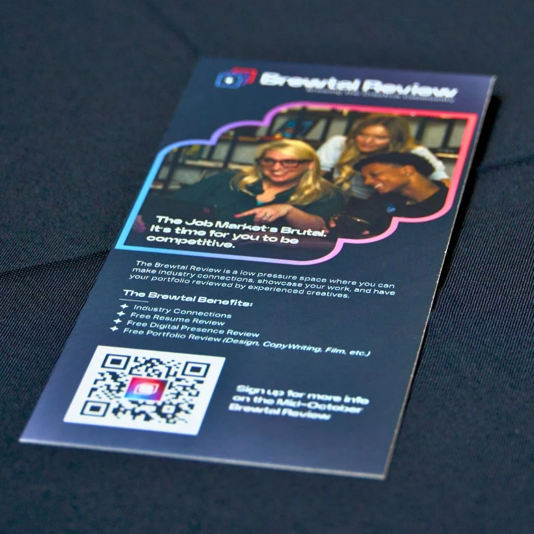
The one sheeter was the main promotional item for the Brewtal Review. It was distributed both digitally, through email, and physically, through flyers handed out at related events. It included all the information someone would need to gain an understanding of what the Brewtal Review is.
One-Sheeter
All copy is written by Colby Cobb. Visit his Brewtal Review portfolio here.
Instagram Carousel Posts:
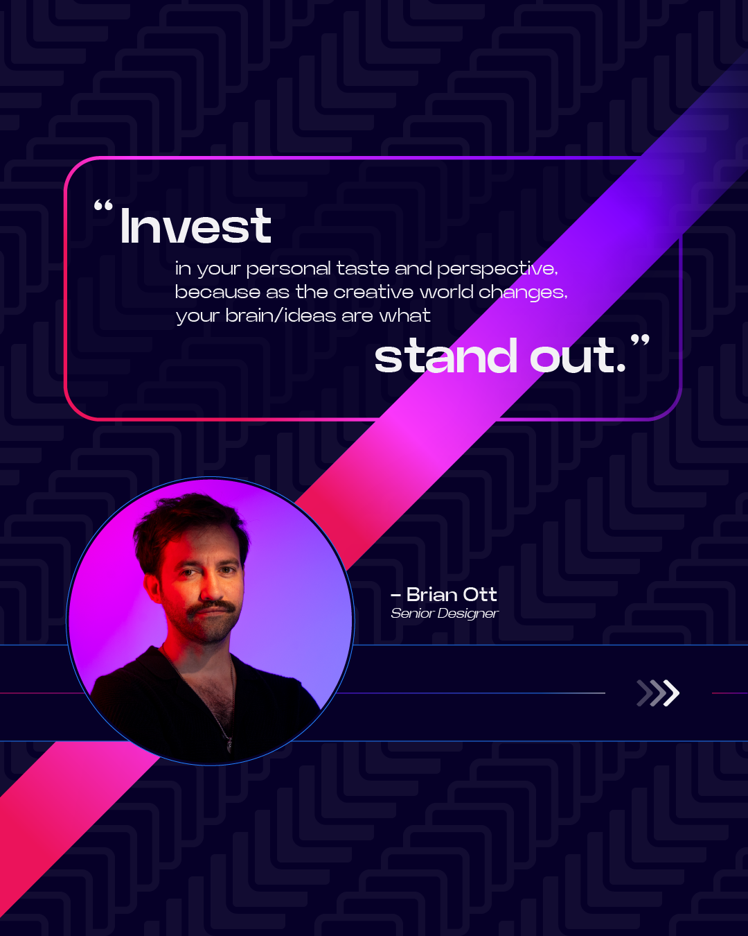
Brewtal Advice #1
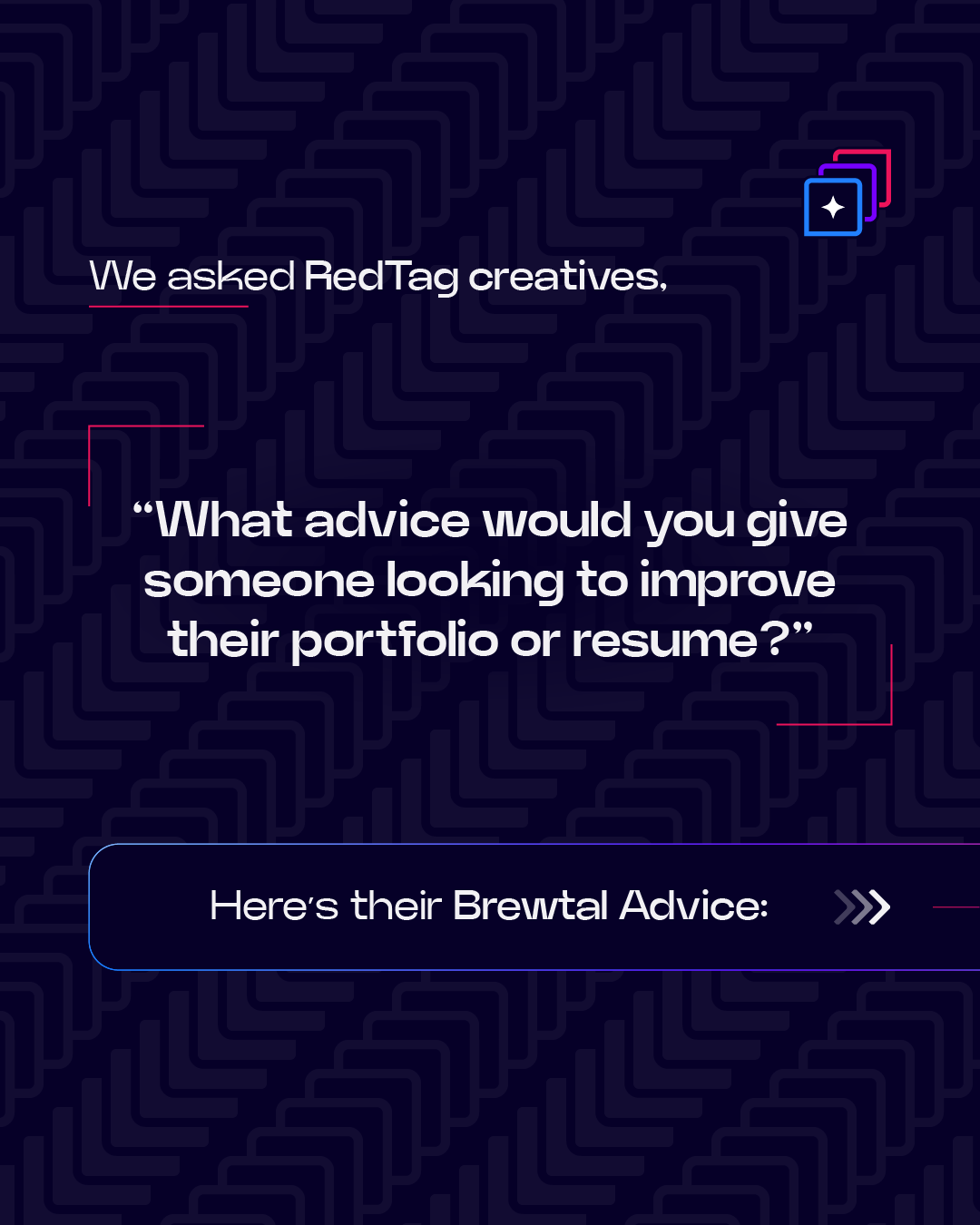
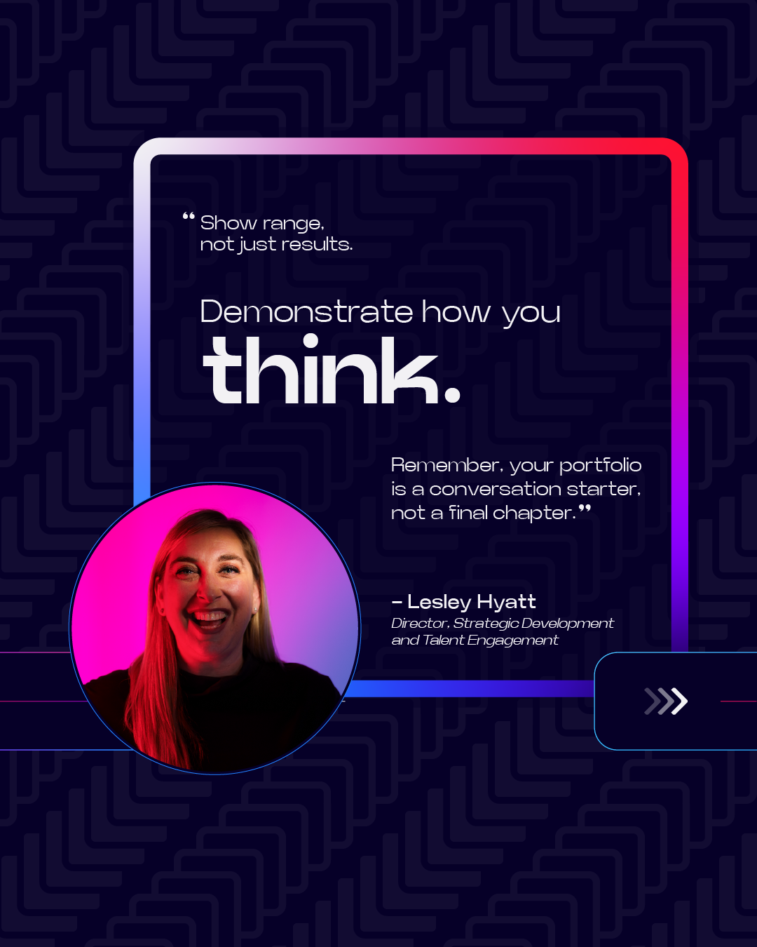
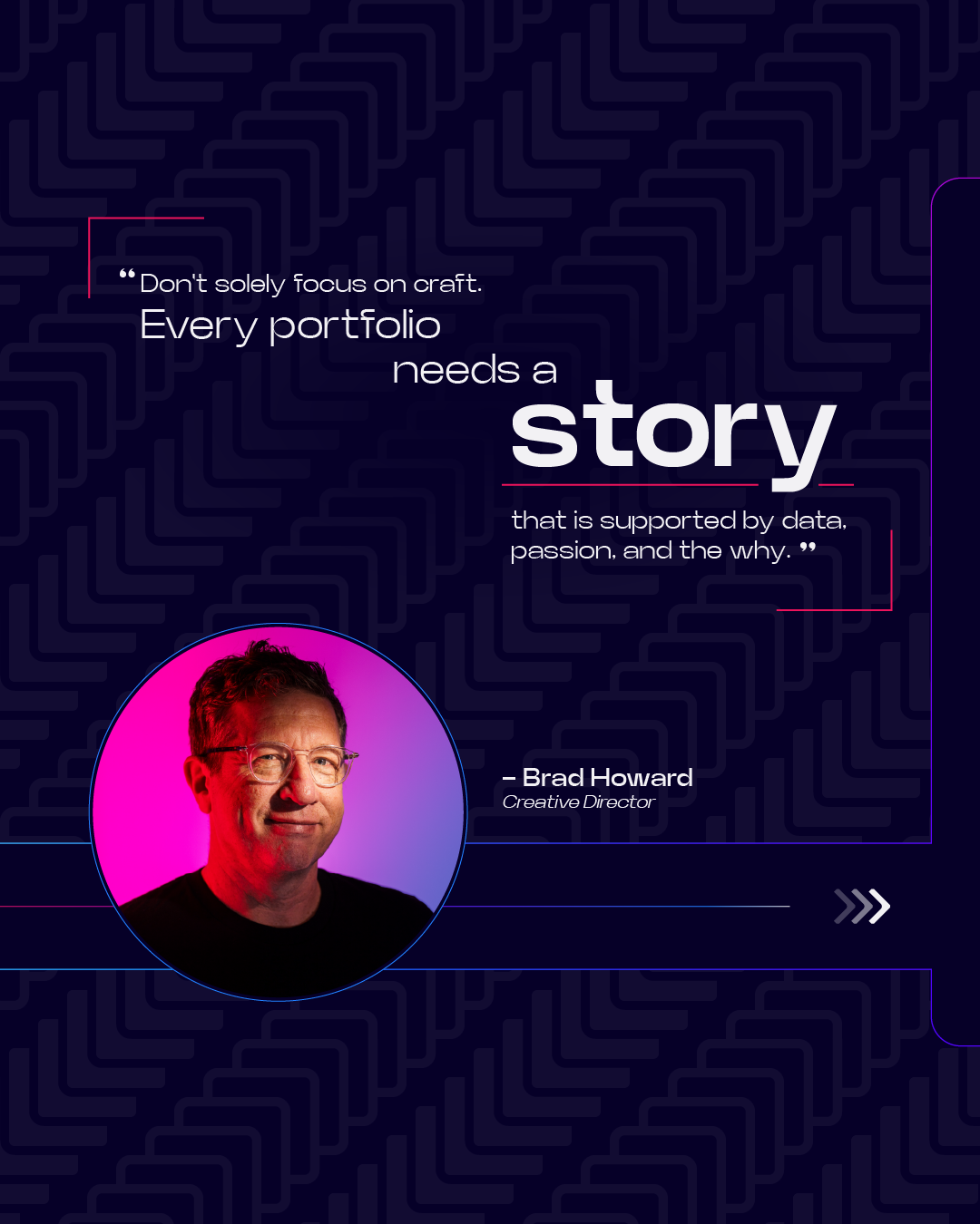


Brewtal Advice #2


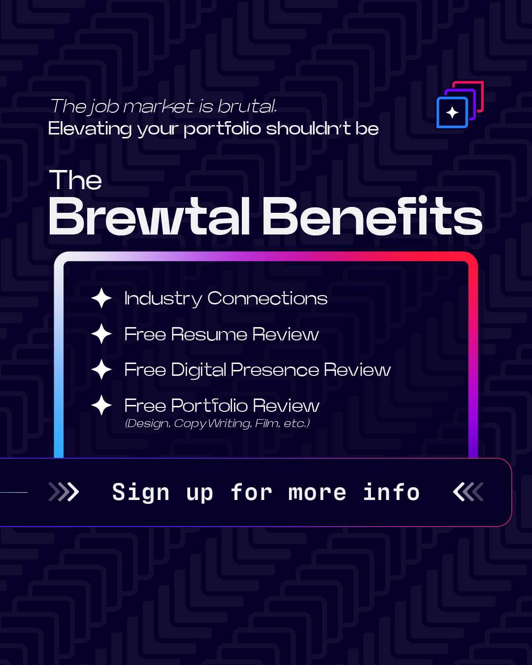
BREWTAL Problem
BREWTAL Benefits
Static version:
With copy from Colby Cobb, I designed the wireframe for the Brewtal Review Launch Party landing page where people would be able to learn about the event and register
website wireframe
See the live Brewtal Review site here
STICKERS
(because who doesn’t love stickers)
Bumper Sticker
Physical Logomark Sticker
Logomark Sticker
Badge Sticker
Rack card
This rack card was displayed on tables at the Brewtal Review Launch Party
Front
Back
Rack Card on display at the Brewtal Review Launch Party.
Misc. Assets
Portfolio Rising
Brewtal Review LinkedIn Ad
In addition to designing the visual identity of the Brewtal Review, I created a library of patterns based on the shape of the logo. These patterns are designed to be easily added to any shape or background.
There are two main patterns: STACK and ARROWS, each in small, medium, and large sizes, plus some alternating versions of both patterns.
PATTERNS
ARROWS

ALTERNATING STACK


STACK

ALTERNATING ARROWS

ALTERNATING

ALTERNATING 2

ALTERNATING 3
BREWTAL IN THE REAL WORLD
RedTag Creative Director, Brad Howard, speaking at the launch party with the Brewtal Review wordmark.
The Brewtal Review logomark on pad-folios given out to event participants.
Pad-folios and rack cards on display before the launch party.
More Brewtal Review:
BREWTAL REVIEW
LOGO
