BREWTAL PROCESS
BREWTAL PROCESS
My journey to create the Brewtal Review visual identity was no easy task. My designs went through multiple variations, stylistic explorations, and full resets before arriving at the final design.
This was an intense project through which I learned to design for a brand vision, revise my ideas, exceed expectations, and deliver a professional final product that is ready for use.
BREWTAL PROCESS
BREWTAL PROCESS
This page will showcase my entire design process from start to finish.

When I arrived at RedTag Digital, we had no direction or ideas for what the Brewtal Review’s visual identity should be. Thus, I had total creative freedom to explore a variety of design aesthetics that could represent the Brewtal Review.
Observe my brainstorming and exploration process below:
INITIAL
IDEAS
BRUTALIST/GRUNGE
AESTHETIC EXPLORATION
The name “BREWTAL” comes from a combination of the world “BRUTAL,” referring to the current job market for creatives, and the word “BREW,” based on drinks and brews and representing the idea of a low-pressure, relaxed environment.
My first branding exploration focused on the word “BRUTAL,” seeking to represent the rough nature of the job market.
The idea of shortening the “BREWTAL PORTFOLIO REVIEW” name to “BPR” was inspired by the Pabst Blue Ribbon beer, which is often referred to as a “PBR,” and embodies the BREW part of BREWTAL.
General consensus was that this visual identity could accidentally portray the event as a brutal, harsh critique—the exact opposite of what we wanted the event to be. However, the RedTag team liked the idea of shortening the name to BPR to play off PBR.
In addition to the brutalist/grunge look, I was asked to create an alternate identity for the event that could live within RedTag’s existing brand identity. Something that could stand independent from, but be related to RedTag.
Observe my brainstorming and exploration process below:
BREWTAL
Within redtag
RedTag Color Palette
Crimson
Ether
Cobalt
Stardust
Deepspace
Using RedTag’s color palette, and continuing the BPR idea, I explored merging the three letters…
…into one shape:
This was the first iteration of the Brewtal logo.
First Brewtal Logo Proof of Concept
BREWTAL
REDO
However, it was clear that this initial logo, while clever in its combination of BPR, did not represent or communicate the fact that this event is a PORTFOLIO REVIEW. Thus, back to the drawing board I went.
I continued exploring variations on the merged BPR idea, but also explored merging a chat bubble and mug icon to represent the conversational and brew-focused attitude of the Brewtal Review
→
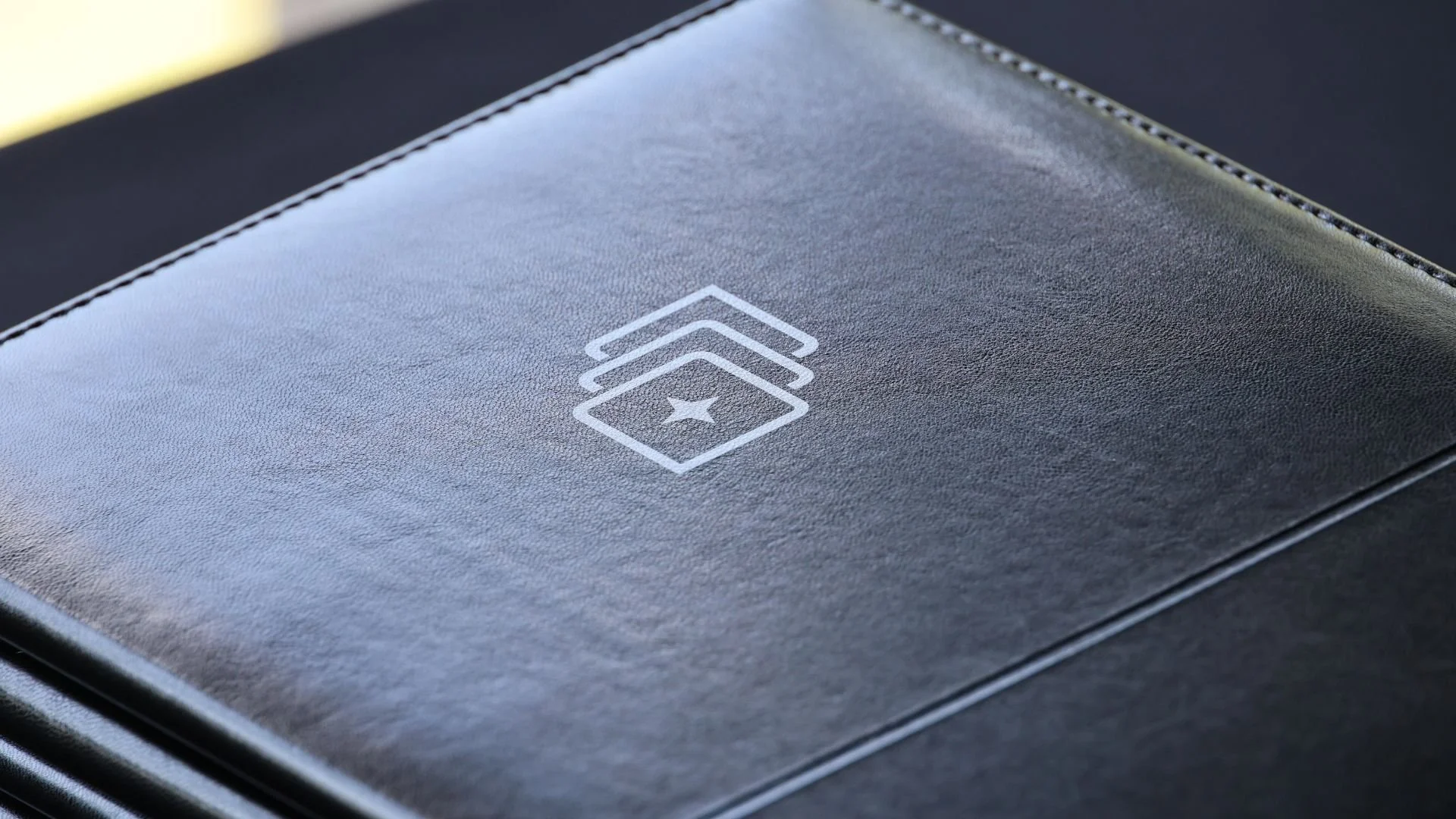
(This becomes the final logo)
The final logo
Rejuvinated from my additional brainstorming, and inspired by RedTag’s existing logo, I created what would become the final Brewtal Review logo.
+
=
Final Brewtal Logo Proof of Concept
More Brewtal Review: